The Best and Worst Fonts for Printing Projects
When it comes to creating readable and attractive printed materials for marketing, the type of font you choose is the most important aspect of the design. Most designers focus on creating eye-catching graphics and adding high-quality content, but apart from the colour and images, fonts are crucial to enhance the readability and overall appearance of the printed material.
In the absence of the right font, the message to be conveyed by your business card, flyer or brochure is lost as the receivers are unable to read the text. When choosing fonts for your marketing tool, make sure that it is clear and easy to read in various printed materials promoting your brand.
If you’re unable to decide which font will be suitable and which one to avoid, then go through this list of the best and the worst fonts for printing projects.
The Best Fonts
1) Rockwell
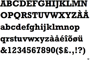
Rockwell is a powerful and bold font that gives a distinctive look to the text. It has a monoline construction with all strokes appearing to be roughly the same width. Ideal for headlines, this serif font is considered to have a lasting impression on the readers as they are more likely to retain the message read. If you want to use the font for display or small-size texts, instead of lengthy messages, then this is your best bet.
2) Century Gothic
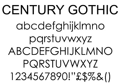
Century Gothic is a geometric style, sans-serif font. It is neat, easy to read and can be read from a distance, thus making it a perfect choice for posters and hoardings. It instantly grabs the attention of the readers and makes the text stand out from the design. Also, it uses less ink than other sans-serif fonts and saves money on your printing project.
3) Verdana
Designed by Matthew Carter for Microsoft, Verdana is a humanist sans-serif font. Originally created to be readable at small sizes on low-resolution screens, this font is a great choice for printing because of its flexibility. If you want a consistent look for the heading and the body text, then consider using Verdana for printing your booklets, brochures or flyers.
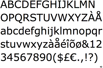
4) Helvetica
Helvetica is one of the most commonly used sans-serif fonts. It has a realist design with notable features that give a dense, compact appearance to the text. The simplistic appeal and high readability of this font make it the preferred choice for logos of top brands such as Microsoft and Panasonic. Also, it is widely used in transportation settings because it has a clean, simple and easy to read appearance.
The Worst Fonts
1) Comic Sans
Comic sans is a font suitable to target a younger demographic and not for a professional printing project. It gives an amateur appeal to the design and fails to make an impression. Viewers find it difficult to read and the unprofessional look of the letters can damage your brand’s identity. Don’t consider it unless you intentionally want to give a comical angle to the design.
2) Impact
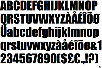
As the name suggests, impact was designed to have an impact. But, the thick strokes and compressed letterspacing of this typeface make it difficult to read. This sans serif font is most widely used in internet memes. However, when it comes to printing a marketing tool for your business that gives a professional vibe, this font should be avoided.
3) Curlz
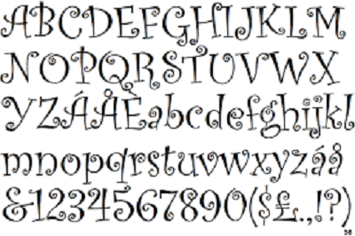
Curlz is a whimsical serif, decorative font designed by Carl Crossgrove and Steve Matteson. You might find it fun to type but it ruins the entire layout when printed. This clumsy-looking, hard to read font can look good on a toddler’s birthday party invitation card but it is way too overwhelming to complement a marketing tool.
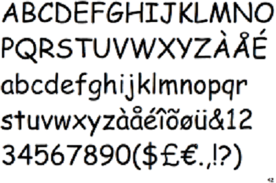
4) Bradley Hand
Bradley Hand is a calligraphy font that looks as if written by hand with a felt tip pen. Although this font has all the details that give it a handwritten character, yet it can’t be used for printing because of its imperfections. It gives a look that the text was written in a hurry leaving a jagged fuzzy edge around each letter.
Hopefully, the above-mentioned list of the best and the worst fonts for printing projects will help you choose the most suitable typeface for printing your business cards, brochures and other direct mail marketing tools. Make sure that you consider the target demographic, product category and your brand image when choosing the right font. To learn more about how to ensure error-free printing projects, contact Micro Printing Ltd. in Mississauga.
