Business Card Blunders – Printing Mistakes to Avoid
Your business card is important to you. It has your name, contact details and company title all in a fancy font. However, according to the stats, roughly 88% of your cards will be thrown out within a week. There are several reasons why this could be the case. Chief among them, are printing errors.
Here is a short list about some of the more common printing errors that you need to avoid.
Loud Borders
You may think an over-the-top, bright, gaudy border makes you seem confident. The truth is that it doesn’t. It’s visually annoying. Think of it as the visual equivalent of shouting at your customers. Instead, go for more subtle borders, roughly ¼ inch wide. This acts like white space, focusing attention on your company details.
Spelling Errors
This is one of the most common mistakes. It just looks unprofessional. Why should a client trust you to do business with if you cannot spot such a simple detail?
Black Backgrounds
Black may be a go-to colour for clothing and fashion, but this isn’t the case for business cards. You see, a card with a black background makes any other colours (other than white) appear blurry. White may look plain, but it’s a better background to add interesting colours, designs and fonts onto.
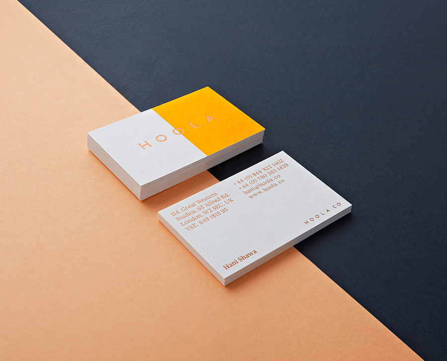
Too Much Unnecessary Information
The company logo, who you are, what you do and how to get in touch with you, is really the only information a business card should have. Other pieces of information such as your hobbies, interests, aspirations and zodiac sign shouldn’t be included. Save those for your social media or dating profile!
Although the majority of business cards may spend their existence in a trash bin after a week, the truth is this marketing resources works. Business cards can increase your company’s profit by 3%. If you are in a hurry and don’t have in-house staff for designing a great business card, hire a professional. He/she can help you avoid the mistakes discussed above!
