How Does the Right Colour System Impact Your Print Marketing?
Did you know that the number of colours used in an image, whether printed on a press or produced digitally, can have a major impact on the minds of your customers? In fact, colours are a tool that is frequently used in the marketing field. Every professional printing company knows how important a good colour palette is for the various designing and printing marketing tools of your brand, such as business cards, brochures, direct mails and so on.
In a previous blog, we have already explained the different factors for choosing the right colour palette for creating a more memorable brand presence. In this post, we will discuss the importance that different colour systems have in your print marketing.
The Importance of Colour
In print marketing, the importance of colour cannot be understated. From the logo of your company to branding and any related promotional printing efforts rely heavily on the colour scheme. As they have the power to uplift mood and impact the inner feelings of the viewer, they can be an influential factor in determining the buying patterns as well. Therefore, understanding the different colour systems is very important.
a. Visual Appeal
Colours are associated with meaning and have the ability to attract a specific category of consumers. They can even control and alter buying patterns. Research by the Department of Administrative Studies at the University of Winnipeg has shown, that people make a decision about a brand within 90 seconds based on their initial reaction. Among these, about 62-90% of the assessment is determined by colours alone. This is more prevalent in the magazines, brochures, and other elements of print media.
b. Brand Presence
Design and colour branding are an integral part of any brand building process. Visual perception can go a long way in getting a consumer attached to a particular brand.
c. Lead Generation
Even the small details in the colour palette can be a determining factor in the consumer making a purchase. Colours have been known to influence the consumer response and conversion rate significantly.
Understanding the Colour Systems
According to colour theory, there are two primary colour systems:


1. Additive
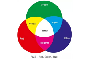
The additive colour system consists of red, green and blue and is also known as the RGB system. This is how our eyes perceive colours, and this colour model is used in anything that emits light, such as computer screens, television sets, and projectors.
This combination of colours is a mixture of different wavelengths of light and becomes brighter and lighter with the increase of light. In this type of colour scheme, white is the amalgamation of every colour, while black is the absence of them.
2. Subtractive or Reflective
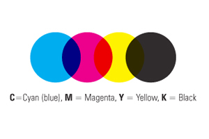
Contrary to this, anything that reflects light uses this type of colour model. A subtractive or reflective system of colour is used for printed media. The colours in a subtractive colour scheme are cyan, magenta, and yellow and are also known as the CMYK system. Unlike the RGB system, CMYK works based on reflected light, and the way we perceive them is determined by the particular pigments reflecting the different wavelength of light.
Also, in this type of colour scheme, black is the combination of colours while white is the absence of them. Of course, this is not a perfect system, and the available pigments are not able to completely absorb light. To overcome this limitation, the printing companies have to add a fourth compensating pigment, which is also called the “key”. In general, it is black, but without this key pigment, the black colour cannot be achieved on print, and it would just appear to be muddy brown.
Achieving a Balance Between the Two
Designers always choose a Pantone Matching System or PMS to achieve a balance between the two aforementioned systems and get a consistent colour result, when printing your business card or brochure. The Pantone system matches with both the web and the print to produce a rather uniform appearance.
Pro Tip
Follow a 60-30-30 rule for your colour schemes to keep a track of the colour proportion, with 60% colour used in the background, the other 30% for the base, and the rest of the 10% for the accent colour.
However, everyone responds differently to colour. So, how can you design something that appeals to them all? Truth be told, the colour factor is dependent on personal experiences as there is no universal formula to generate feelings. But there are some broader patterns that can be followed as a general guideline.
Colour acts as a stimulus to our brains and affects our decision making, which is why it’s important to choose the right colour scheme for your printed media. As it is an intersection of arts and science, understanding the different systems can help you achieve a dynamic design for your brand. If you want to portray your brand’s personality traits with your brochures, magazines, and logo, then getting in touch with an informed and experienced designer, as well as a renowned printing company in Mississauga or Toronto, can prove to be fruitful.


