7 Rules of Effective Flyer Printing Every Toronto-Area Business Should Know
Every year, hundreds of businesses across the Toronto area invest in flyers, but many fail to deliver the results owners expect. That doesn’t mean that flyers don’t work; it means many don’t work because of low print quality and poor design choices that make them easy to ignore.
A flyer with a cluttered message, low visual impact, or an inexpensive feel will not represent your business value well, no matter how strong your offers are. Flyer printing remains one of the most cost-effective ways for Toronto-area businesses to convey their marketing message, but only when it’s done right.
At Micro Printing, we bridge the gap with high-quality flyer printing that brings your message to life with clean layouts, sharp visuals, and a professional finish that is hard to ignore.
This guide covers seven essential rules of flyer printing in the Toronto area. It will help you avoid costly printing mistakes and get professional flyers that truly work for your business.
Key Takeaways
- Crisp graphics, high-definition images, and your business’s own photographs boost your brand value.
- Use easy-to-read typography, stick to one or two fonts, and organize the text by importance to make the flyer’s message easy to understand.
- Include a simple, clear CTA so readers know what to do next and can act accordingly.
- Keep your message concise, proofread well, and use premium paper so readers perceive it as high quality.
A Toronto-Area Business Owners’ Guide to Flyer Printing’s Core Rules
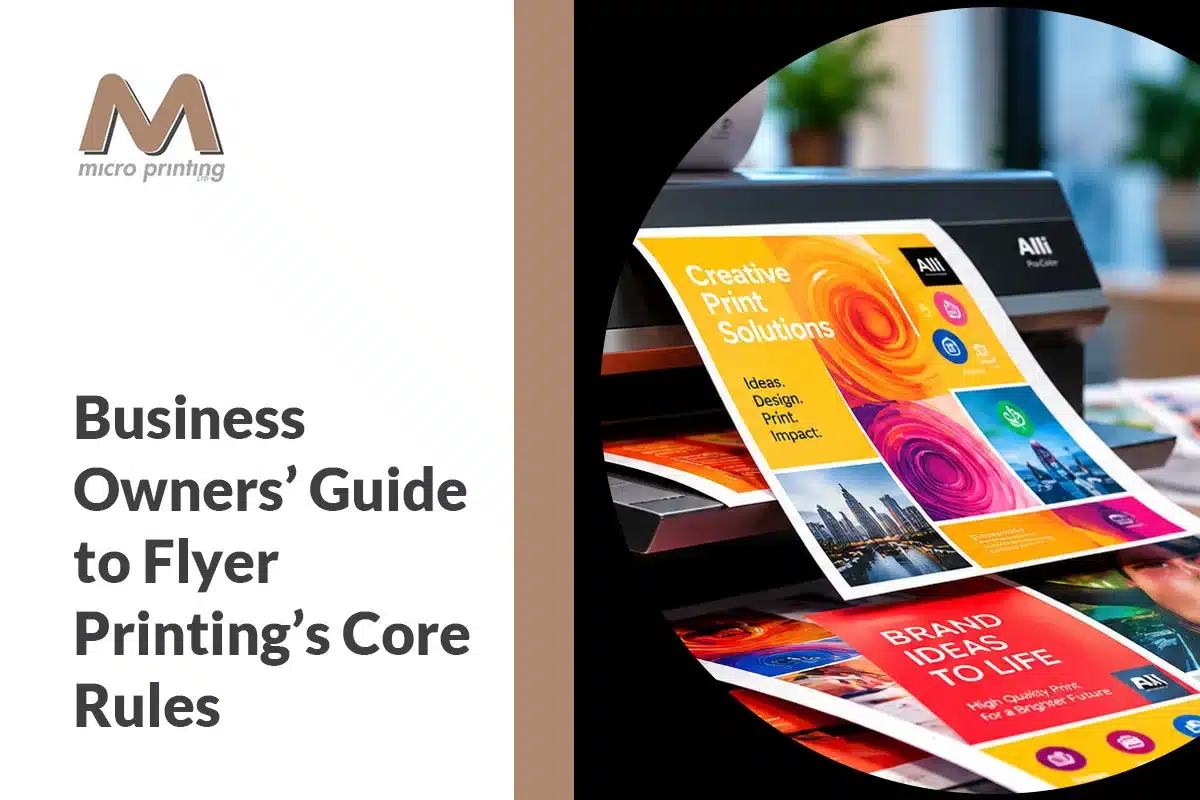
These rules cover everything from design fundamentals to paper choices, giving you a strong foundation for creating flyers that actually work.
Use High-Quality Visuals That Attract People’s Attention
Visuals aren’t just for making flyers look good; they also build trust with your audience. This is the first thing your audience sees, even before they read a single word. Blurry or pixelated images can signal low quality and degrade your brand’s image. That’s why you should use crisp graphics and high-definition images in your flyer that stay clear and compelling at print size.
For instance, instead of using a stock image, you can use your business’s own photographs to attract attention. High-definition, real images give your potential customers an accurate, compelling picture of what you are selling, making it easier for them to trust you and take action.
Choose an Easy-to-Read Typography
No matter how strong your marketing message is, if your audience can’t get through it without struggling, then it will be of no use. Stick to one or two clean, easy-to-read fonts, and organize your text by importance across the flyer. Don’t use too many fonts or stuff it with too much text, as it can overwhelm the reader and make your flyer harder to engage with.
Simplicity in typography improves readability and your flyer’s overall visual appeal. For instance, a newly opened gym handing out flyers to locals can get better results by sticking to key offers, timings, and contact details in simple typography. This simplified typography and clear information help audiences act instantly instead of feeling overwhelmed and ignoring your call to action.
At Micro Printing, we offer practical advice on flyer creation so you can choose typography that keeps your message clean, readable, professional and hard to overlook.
Include a Clear CTA (Call to Action) That Tells Readers What to Do Next
Your flyer should give readers clear direction after they engage with your marketing message. Whether it is signing up for a newsletter, visiting your store or website or attending an event, your message should be direct, clear, and easy to act on. Unclear or vague CTAs can confuse readers about the next step, thus losing the conversion potential. For that reason, convey what you want them to know and make it as seamless as possible to follow through.
Keep Your Message Focused and Concise
Readers generally give only a few seconds to read your flyer after getting it in hand. If they don’t find anything interesting, they are likely to ignore it.
Choose every word carefully so it earns its place. Avoid including every detail about the products or services you offer. Instead, include one core message and communicate it clearly.
For example, a technology firm based in the Toronto area marketing a new HRM (Human Resource Management) application is more likely to make a stronger impact with the headline “Manage Your Team Effortlessly” than with a headline that includes all the application’s specifications. Adding a short call to action, like “Visit our website,” makes it easy for readers who want to learn more.
Proofread Well Before Sending It to Print
Once your flyer goes to print, any error is likely to become expensive to fix. Grammatical errors, incorrect contact information, inaccurate facts, spelling mistakes, or the wrong QR code can undermine the professionalism of your brand that took years for you to build.
For instance, a grocery store handing out a flyer for its exclusive limited time offers needs readers to scan a QR code imprinted on it. This code is supposed to direct them to the ‘Offer’ section of the business. But if readers are redirected to other pages, they may lose interest, spend less time searching, and view your brand as less credible.
Proofread your content multiple times and, if possible, have a second and third person review it before approving the final file for printing. Careful checking can save you more money than you can expect.
Choose Premium Paper and Professional Printing
The physical feel of your flyer communicates your brand standard even before the reader processes its message. A flyer printed on low-quality, thin paper is more likely to be disposable and forgotten. For that reason, invest in the right paper stock and a professional printing process that makes your flyer look professional and credible to your target audience.
Professional printing goes beyond putting ink on paper. It also includes sharp image reproduction, calibrated colour accuracy, consistent ink coverage, and a clean finish, with gloss or matte options for a polished, professional look.
For instance, a luxury car dealer will never hand out a low-quality, flimsy promotional flyer because the paper quality itself is a strong indicator of the brand experience. From paper weight and quality to printing precision, everything should convey the professionalism your business brings to the customer. So, high-quality printing isn’t simply an added cost; it’s a brand investment that is likely to pay off in the long term.
As one of the most reputable printing companies in the Toronto area, Micro Printing can help your business make that investment worthwhile with professional services built on precision.
Plan Your Layout Design with Purpose
A well-structured flyer layout guides readers’ eyes smoothly from one element to the next. So, think carefully about where to place the headline, whether your text and visuals are balanced, whether they look cluttered, and what readers will see first, second, or last. A disorganized layout can overwhelm readers and confuse them, leading them to disengage before they reach your CTA.
Take, for instance, a Toronto bakery handing out flyers to promote its weekend special offers. A well-planned layout will likely place an attention-grabbing headline at the top, a mouth-watering product image in the middle, and a simple CTA at the bottom. This information and visual flow can quickly turn audience attention into action. Without a proper structure, even a well-designed flyer may leave readers confused about what to do and discard it without a second thought.
Professional flyer printing can do more for your Toronto-area business than you think. From choosing the right typography and visuals to picking the right paper stock, every detail matters in making flyers high-performing. At Micro Printing, we support you every step of the way. Reach out to us for high-quality flyers that truly represent your brand value and help your audience notice and choose your products or services.
FAQ
How much text should I put on my flyer?
Include only what is necessary for the understanding of your readership. One strong headline, a short supporting message, and an easy-to-understand call to action are all you need.
How many fonts can I use on my flyer?
Try to stick to one or two clean and easy-to-understand fonts throughout your flyer. Using multiple fonts or stuffing your flyer with too much text is likely to overwhelm readers and make your flyer hard to engage with.
How do I make sure my flyer looks professional before sending it to print?
Proofread your flyer several times, and if possible, have at least two other people proofread it before you approve the file for print. Check all important details, like the price, contact information and the QR code, to ensure everything is correct and points in the right direction.
Does paper quality really make a difference to how my flyer performs?
Absolutely, it does. The weight and finish of your flyer paper communicate your brand to your audience long before they read your message. A professionally printed flyer on the right paper stock conveys credibility and is less likely to be discarded.